
Marco Bijl
Creative Director - ucomo.
What did happen?
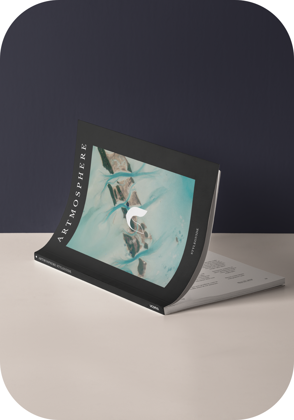
Design Library
Branding
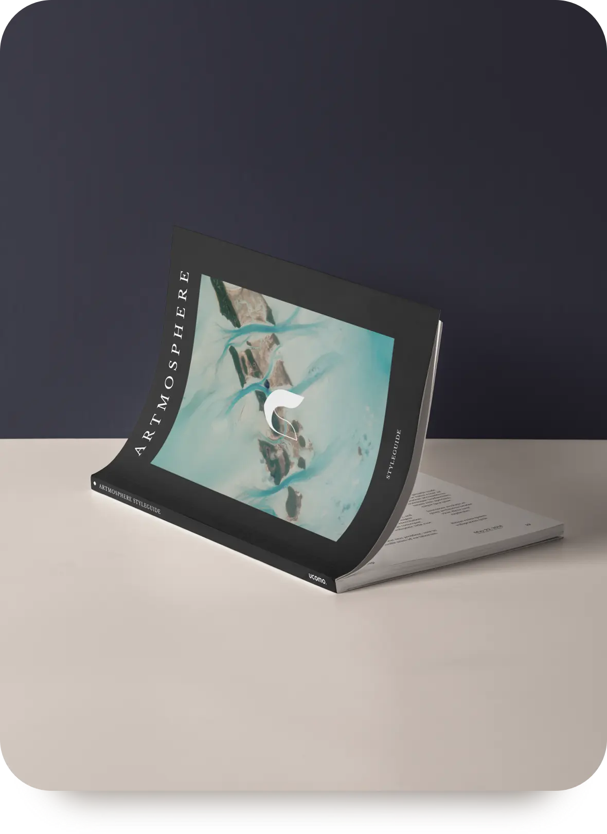
Artmosphere is a web and branding agency based in the Netherlands. Aiming for the sky the brand needed something powerful to impress, yet we needed to be playful to not being taken too seriously.
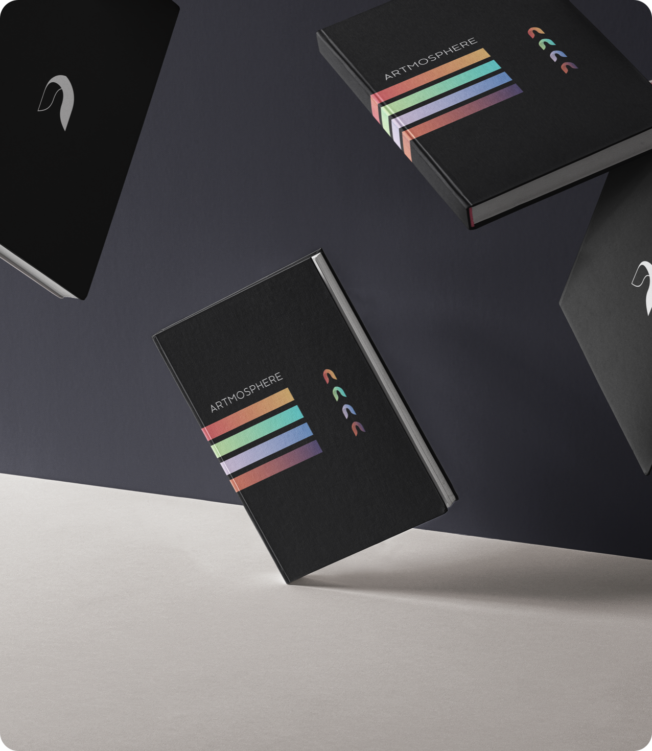
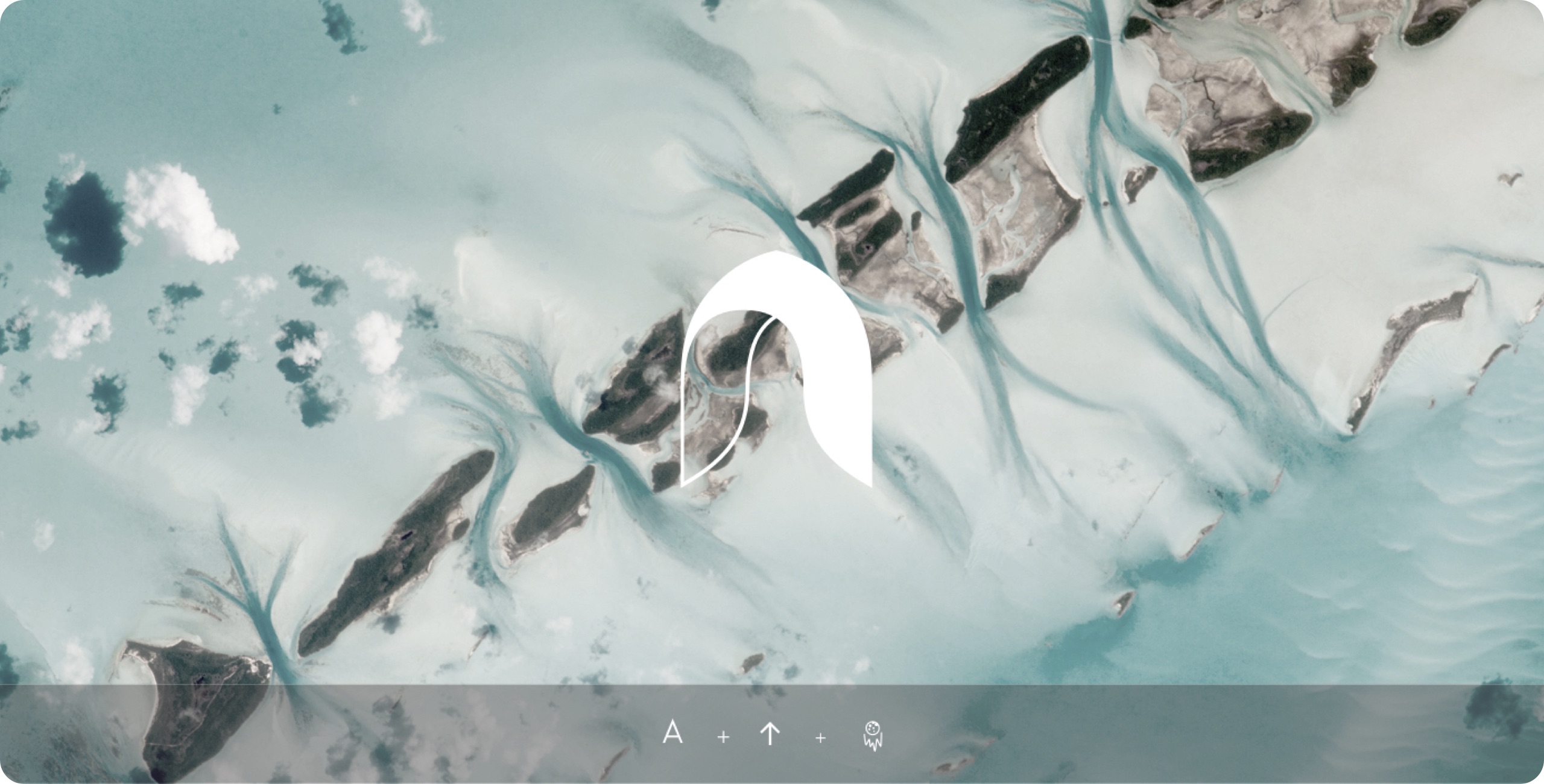
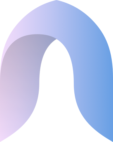
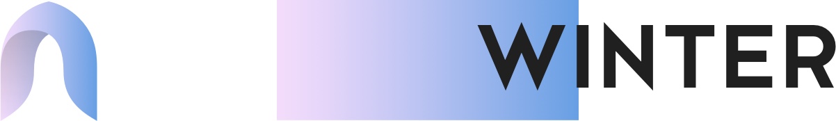
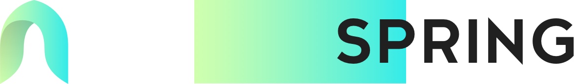
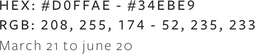
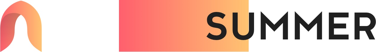
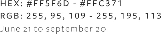
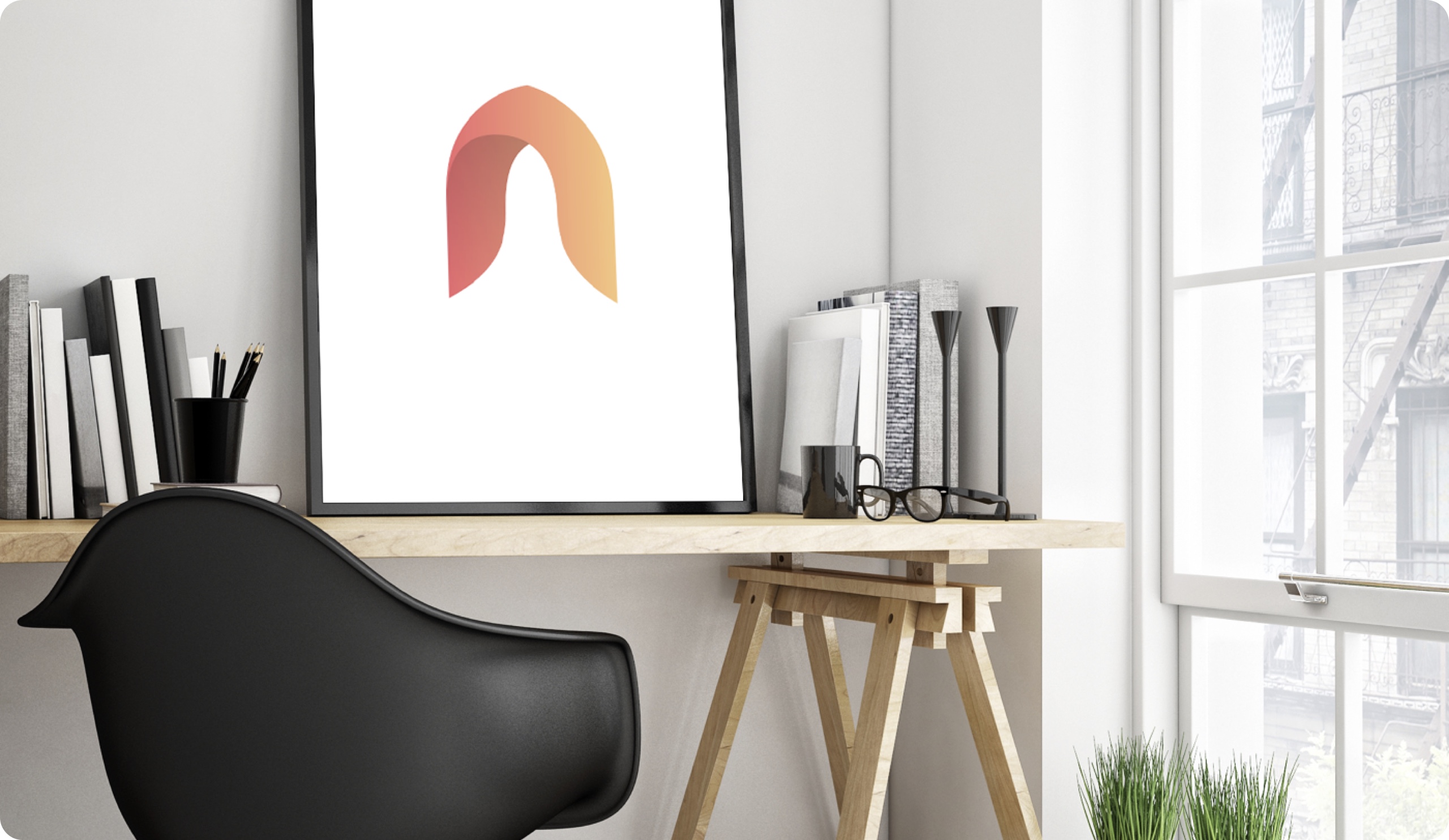
A dynamic logo that can be filled with the most brilliant gradients. These gradients are chosen carefully to fit a specific time of the season. Artmosphere is pushing the digital era into space to define the next level of branding and design. That's why an arrow/rocket shape in combination with a minimalist “A” to create a powerful and meaningful representation.
Ever since Artmosphere started there was always was a love for gradients. The feeling of combining 2 beautiful colors made it possible to transfer the feeling of the different season's trough a spectrum of beautiful and strong color palettes.


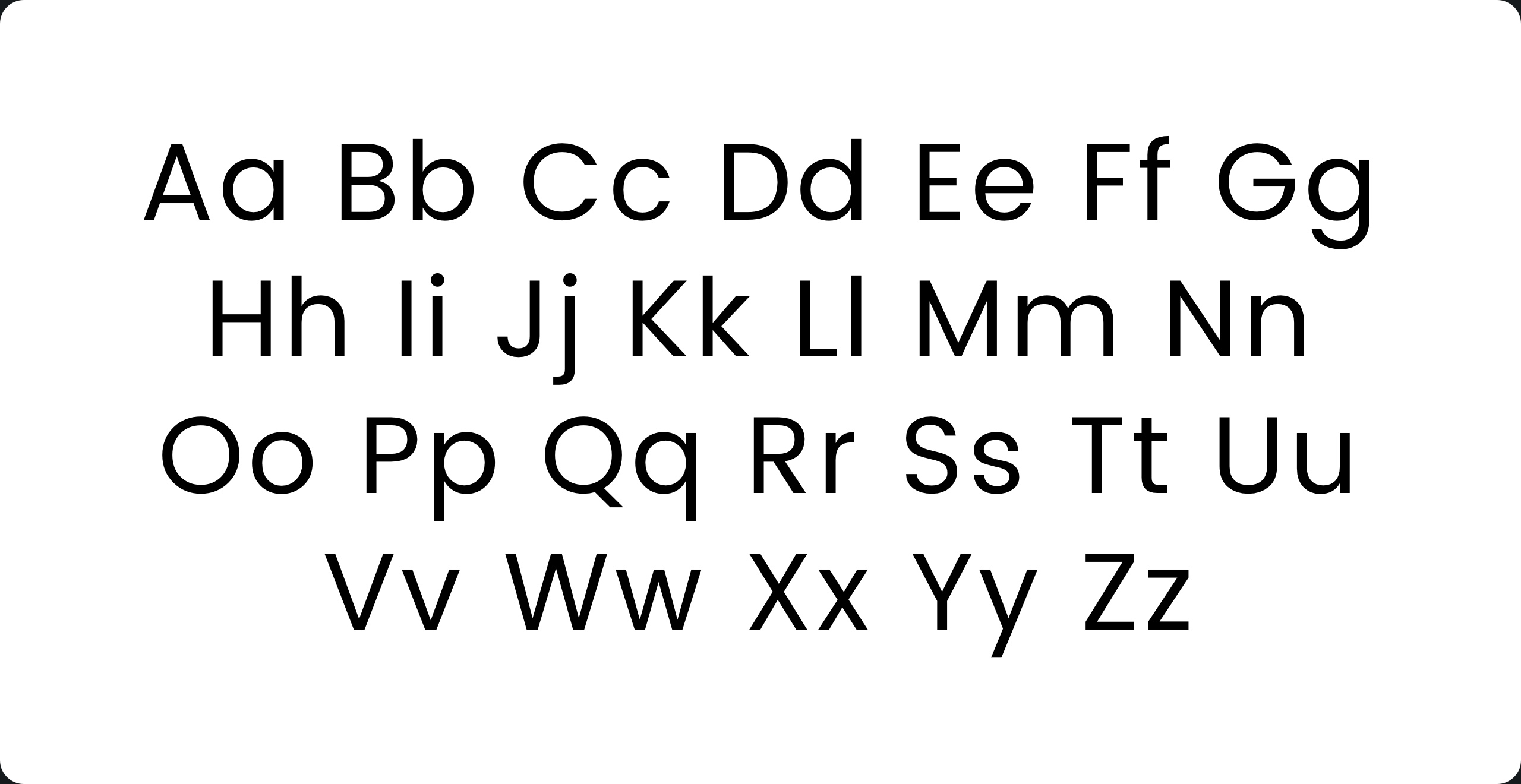
Typography might be the most important element in any design. For composition and accessibility reasons. Typography also has a huge impact on the language you want to transfer to anyone. For artmosphere there needed to be a very strict and geometric professional yet playful touch to define the brand. 2 beautiful fonts were picked to enhance this experience.
Kessel 105 is inspired by the classic, geometric sans-serifs such as Futura, but has shallower ascenders and descenders for a more compact look, and features an art deco influence with sharp points at the apex of many characters. It’s a versatile, modern sans, highly legible as a text font and with a clean, elegant look as a display font at larger sizes.
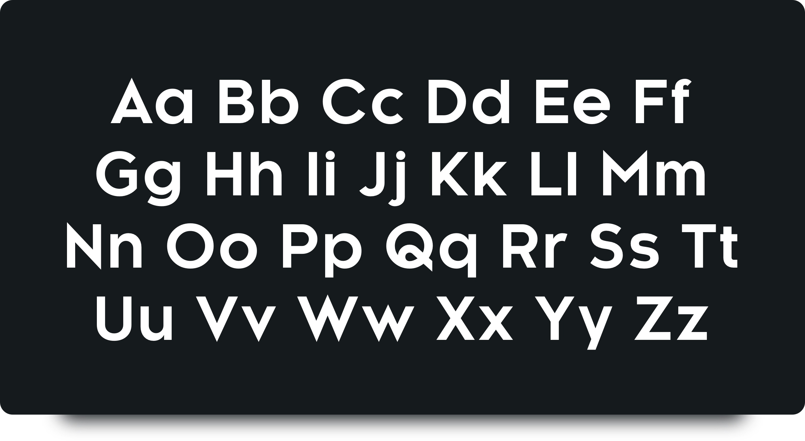
Geometric sans serif typefaces have been a popular design tool ever since these actors took to the world’s stage. Poppins is one of the new comers to this long tradition. With support for the Devanagari and Latin writing systems, it is an internationalist take on the genre.
Artmosphere is a dutch brand, we are straight forward and to the point. We are lucky here to have 4 seasons and the focus was to get these seasons colored up towards branding. Looking at different images over these years within a season, we have defined different gradients that should trigger people's emotions to link with a specific time of the year. The idea is to dynamically change the icons when a new season has started.

Artmosphere was founded with one goal, to help people be amazing online and offline, artmosphere was a great help to all kinds of people in need of a better online and offline presence but needed to be sunsetted to grow to something bigger and better than nowadays goes by the name of ucomo founded Marco Bijl
Thomas A. Edison
American inventor
Artmosphere was founded back in 2017
ucomo is still driving digital work for clients from the artmosphere era
Artmopshere had 2 founders at first day